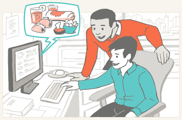
A new service allows restaurants to create mobile- and web-friendly versions of their menus. The client wanted to depict the app’s convenience for customers wherever hunger strikes.
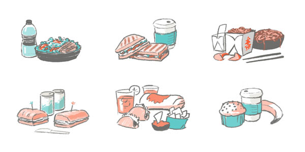
I created these illustrations to fill a rotating carousel on the website home page, emphasizing the diverse customers and their ordering habits. These illustrations show how the app can connect restaurants to their customers — wherever they are and whatever they’re craving.
The client enjoyed some of my sketchier styles and wanted to keep that rough liveliness in the final illustrations. A big emphasis was that the illustrations would feel lifelike and natural while still being simple and stylized. The client loved my rough sketches so a few times we would need to retool the finished quality images to look more like the roughs. We stuck with a limited color palette for consistency with the rest of the website.

See more views of this project: Menu App Illustrations


No comments:
Post a Comment